6  Customising Plots

Nearly everything you can see on the plot can be customised. The default values are normally fine, but when we want to communicate something we sometimes need to be a little more intentional about what we want.

Let’s work with the data from Figure 3 in Fischer-Tlustos (2020): https://doi.org/10.3168/jds.2019-17357

Use the csv button in table below to download this data, and import it to your R session.

Code
six_SLN <- data.table::fread('./data/six_SLN_data.csv', na.strings = ".")


DT::datatable(data = six_SLN,
                extensions = c('Buttons','FixedColumns'), 
                options = list(
                  pagelength=20,
                  paging=FALSE,
                  dom = 'Bfrtip',
                  buttons = c('copy', 'csv', 'excel'),
                  columnDefs = list(list(className = 'dt-center', targets = "_all")),
                  # fixedcolumns options
                  scrollX = TRUE,
                  scrollY='400px',
                  fixedColumns = list(leftColumns = 2)
            ) )

Check the structure of the data:

```{r}
six_SLN %>% glimpse()
```
Rows: 200
Columns: 5
$ Cow_ID        <int> 5800, 5716, 5769, 5798, 5775, 5749, 5796, 5755, 5788, 57…
$ Milking       <int> 1, 1, 1, 1, 1, 1, 1, 1, 1, 1, 1, 1, 1, 1, 1, 1, 1, 1, 1,…
$ Parity        <chr> "H", "H", "H", "H", "H", "H", "H", "H", "H", "H", "MP", …
$ six_SLN_conc  <dbl> 34.44517, 34.97389, 45.60705, 130.29541, 67.81169, 87.65…
$ six_SLN_yield <dbl> 413.3420, 279.7911, 501.6775, 325.7385, 237.3409, 525.93…

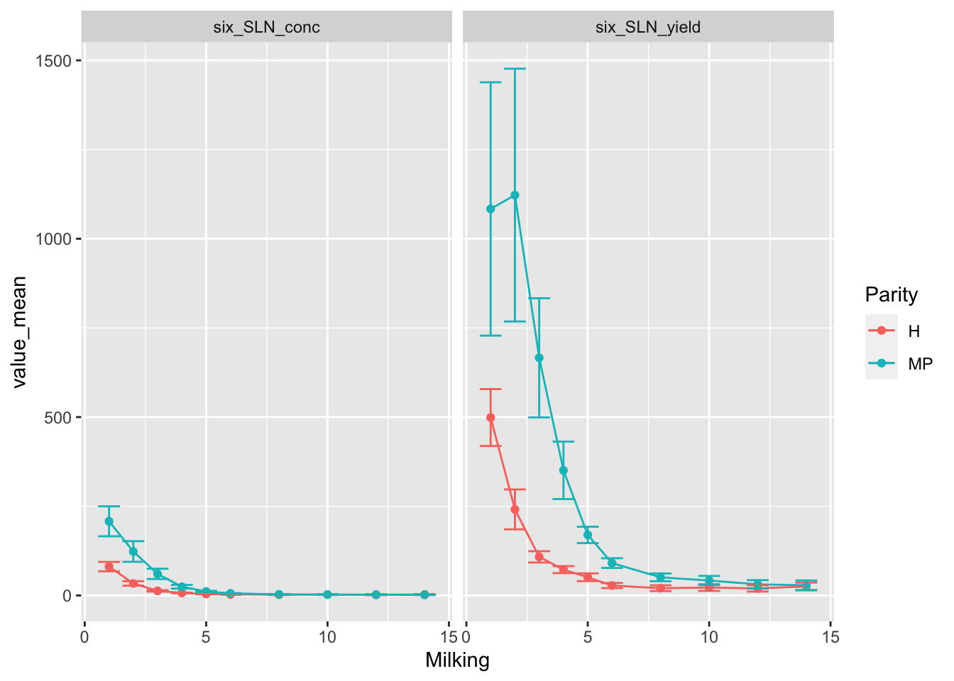
Looking at this, we can see that the variable we want to facet by is ‘conc’ vs ‘yield’. We could do this, and it’s perfectly valid. But in reality, these 2 plots are not using the same scale and should be built separately.

Demo of how to do it as-is with facets:

Code
```{r}
#| code-fold: true

# pivot data to a format that will work with faceting
six_SLN_long <-
  six_SLN %>% 
  pivot_longer(cols = contains("six_SLN"),
               names_to = "units_type",
               values_to = "measured_value")

# summarise data and calcuate values we need
six_SLN_to_plot <- 
  six_SLN_long %>% 
  group_by(units_type, Parity, Milking) %>% 
  summarise(across(measured_value, 
                   list(mean = ~ mean(.x, na.rm=TRUE),
                        sd = ~ sd(.x, na.rm=TRUE)),
                   .names = 'value_{.fn}'),
            n = n()) %>% 
  mutate(value_SEM = value_sd / sqrt(n),
         ymin = value_mean - value_SEM, 
         ymax = value_mean + value_SEM) %>% 
  select(-value_sd, -n)
```
`summarise()` has grouped output by 'units_type', 'Parity'. You can override
using the `.groups` argument.
Code
```{r}
#| code-fold: true

# plot

six_SLN_to_plot%>% 
  ggplot(aes(
    x = Milking, 
    y = value_mean,
    colour = Parity))+
  geom_point()+
  geom_line()+
  geom_errorbar(aes(ymin=ymin, ymax=ymax))+
  facet_wrap(vars(units_type))
```

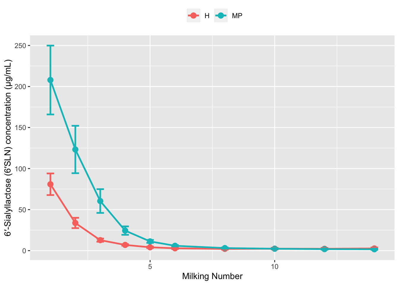
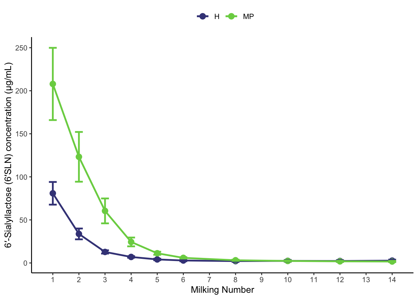
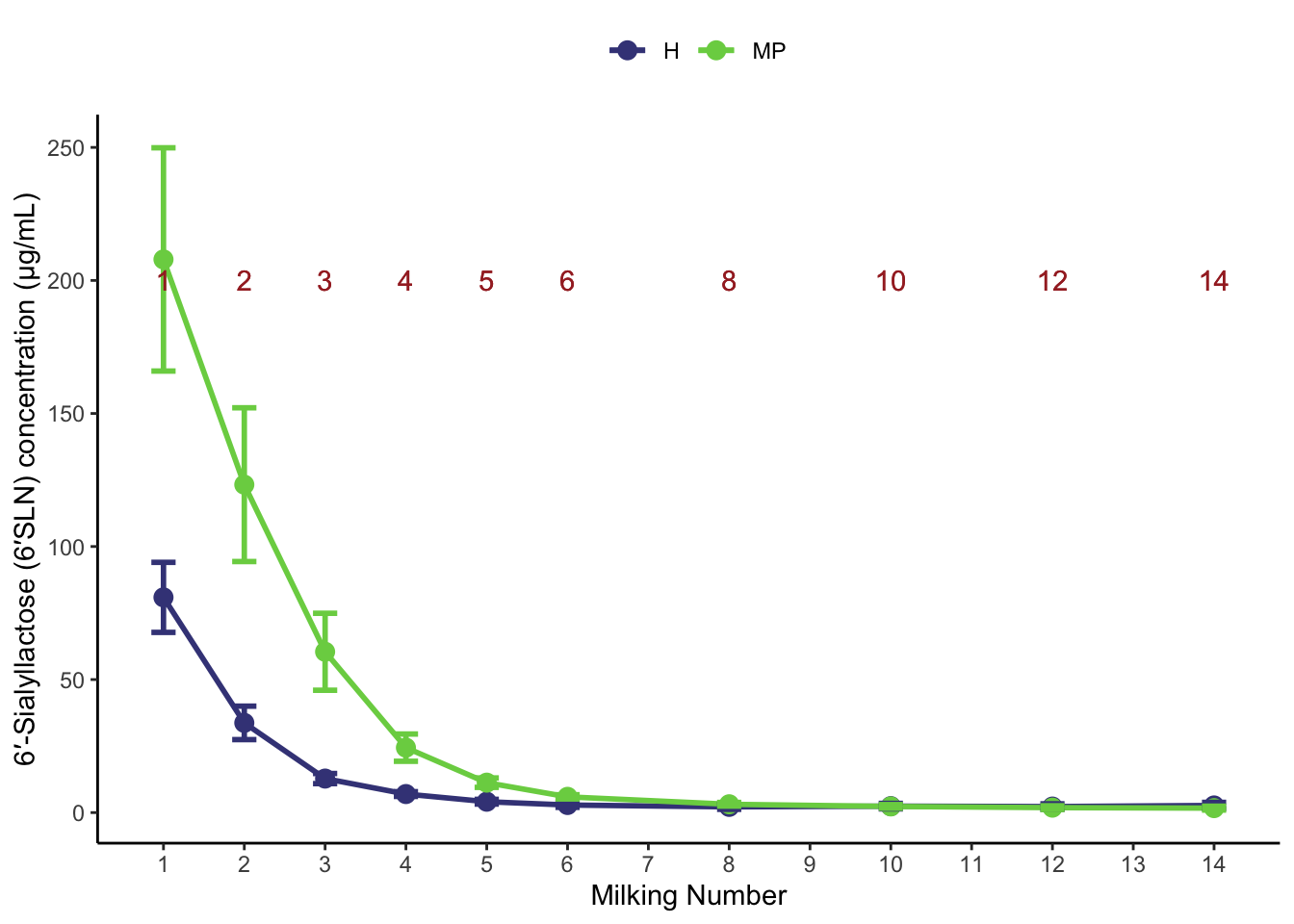
Instead, let’s focus on the concentration plot for now. First, lets remove the yield column, summarise the data, and add on the columns we need to plot with:

```{r}
# Prepare data:
(six_SLN_conc_to_plot <- 
  six_SLN %>% 
  select(-six_SLN_yield) %>% 
  group_by(Parity, Milking) %>% 
  summarise(SLN_conc_mean = mean(six_SLN_conc, na.rm = TRUE),
            SLN_conc_sd = sd(six_SLN_conc, na.rm = TRUE),
            n = n()) %>% 
  mutate(SLN_conc_SEM = SLN_conc_sd / sqrt(n),
         ymin = SLN_conc_mean - SLN_conc_SEM, 
         ymax = SLN_conc_mean + SLN_conc_SEM) 
)
```
`summarise()` has grouped output by 'Parity'. You can override using the
`.groups` argument.
# A tibble: 20 × 8
# Groups:   Parity [2]
   Parity Milking SLN_conc_mean SLN_conc_sd     n SLN_conc_SEM    ymin   ymax
   <chr>    <int>         <dbl>       <dbl> <int>        <dbl>   <dbl>  <dbl>
 1 H            1         80.9        41.6     10       13.2    67.7    94.1 
 2 H            2         33.7        19.9     10        6.29   27.4    40.0 
 3 H            3         12.8         6.02    10        1.90   10.9    14.7 
 4 H            4          6.97        2.82    10        0.893   6.07    7.86
 5 H            5          4.09        2.81    10        0.889   3.20    4.98
 6 H            6          2.85        2.78    10        0.879   1.97    3.73
 7 H            8          2.15        2.91    10        0.920   1.23    3.07
 8 H           10          2.42        3.26    10        1.03    1.39    3.45
 9 H           12          2.26        3.26    10        1.03    1.23    3.29
10 H           14          2.68        3.65    10        1.15    1.53    3.84
11 MP           1        208.        133.      10       42.0   166.    250.  
12 MP           2        123.         91.4     10       28.9    94.4   152.  
13 MP           3         60.4        45.7     10       14.5    46.0    74.9 
14 MP           4         24.4        16.2     10        5.12   19.3    29.5 
15 MP           5         11.3         5.60    10        1.77    9.48   13.0 
16 MP           6          5.92        2.50    10        0.789   5.13    6.71
17 MP           8          3.13        2.18    10        0.688   2.44    3.81
18 MP          10          2.32        2.19    10        0.692   1.63    3.01
19 MP          12          1.86        2.19    10        0.692   1.17    2.55
20 MP          14          1.68        2.31    10        0.730   0.949   2.41

Then, we can make our basic plot:

```{r}
(p_CONC_6_SLN <- 
six_SLN_conc_to_plot %>% 
  ggplot(aes(x = Milking, 
             y = SLN_conc_mean,
             colour = Parity))+
  geom_line()+
  geom_point()+
  geom_errorbar(aes(ymin = ymin, ymax = ymax))
)
```

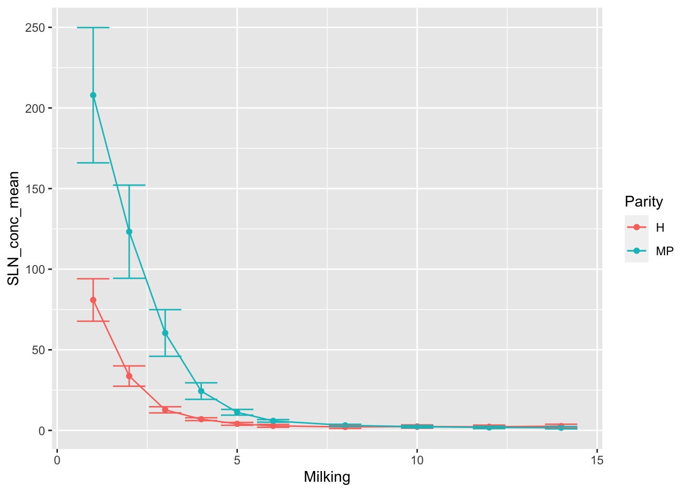
Before we get too fancy, let’s increase the size of our lines and points:

```{r}
(p_CONC_6_SLN <- 
six_SLN_conc_to_plot %>% 
  ggplot(aes(x = Milking, 
             y = SLN_conc_mean,
             colour = Parity))+
  geom_line(linewidth = 1)+
  geom_point(size = 3)+
  geom_errorbar(aes(ymin = ymin, ymax = ymax), 
                linewidth = 1,
                width = 0.3) # this is the width of the eror bar itself. See help for info.
)
```

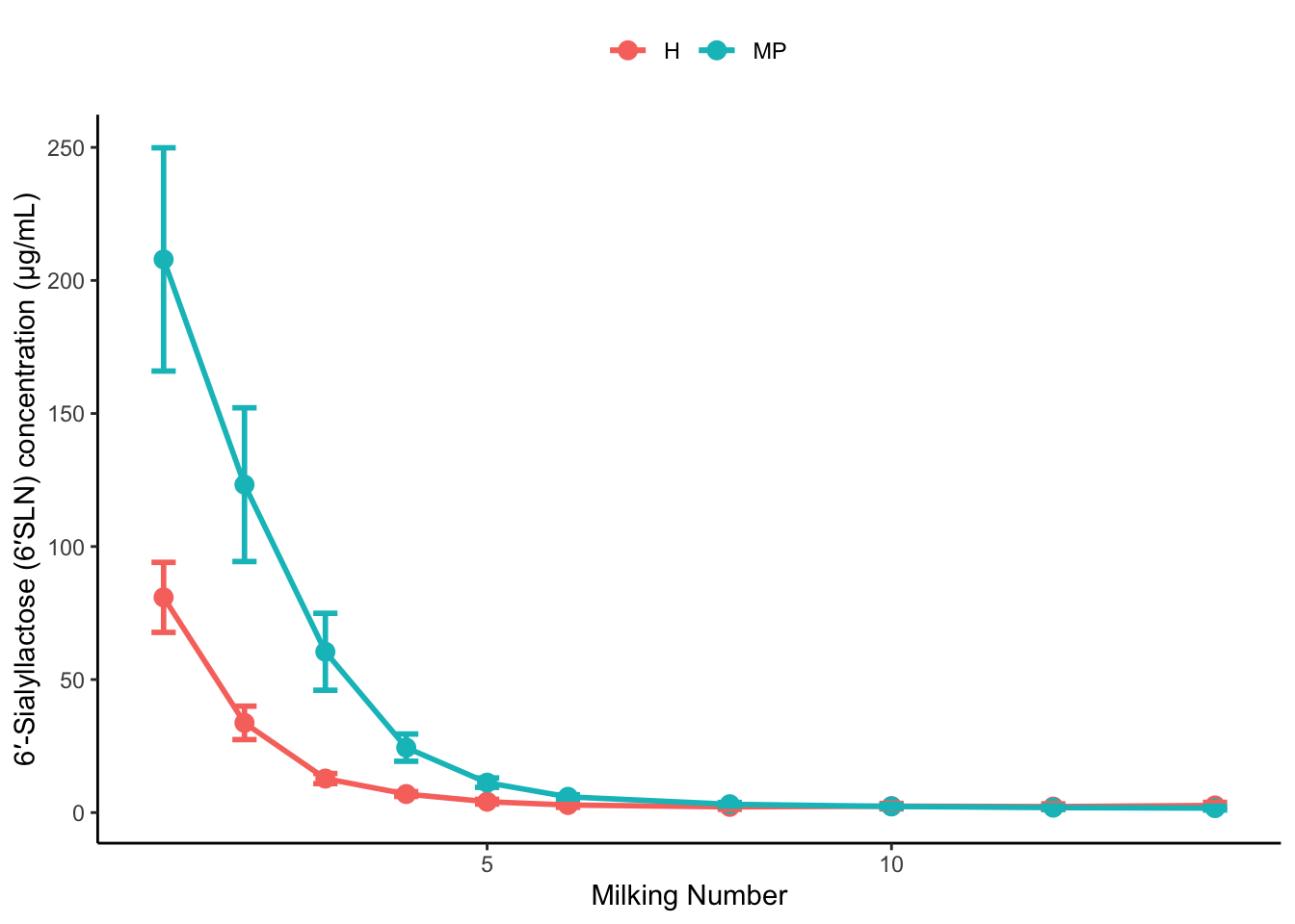
6.1 Labels and Legends

Modifying the axis labels and legend title is often a good place to start.

```{r}
( p_CONC_6_SLN <- 
  p_CONC_6_SLN +
  xlab("Milking Number")+ # x axis label
  ylab("6′-Sialyllactose (6′SLN) concentration (μg/mL)") ) #y axis label
```

Now, we might want to remove the heading for the legend and put the legend at the top:

```{r}
# rename legend to nothing ("")
# the legend represents an aesthethic, so it's actually this label we are changing.
(p_CONC_6_SLN <-
   p_CONC_6_SLN+
   labs(colour = "")+
   # change position of legend
   theme(legend.position="top")
)
```

6.2 Themes

Above we introduced the theme() function. There are actually a bunch of built-in themes which is often a good starting point. See: https://ggplot2.tidyverse.org/reference/ggtheme.html

Let’s add the classic theme. This will override our previous theme() to move legend, so we have added again here, after the built in theme is used.

```{r}
(p_CONC_6_SLN <-
   p_CONC_6_SLN+
   theme_classic()+
   theme(legend.position="top"))
```

This theme() function is where you can customise a lot! To see all of the options, look at the theme help page.

For a detailed description of themes, see: https://ggplot2-book.org/polishing.html#modifying-theme-components

6.3 Modifying Scales

One noticeable problem is that our x axis scale doesn’t show all of the milking numbers like we wanted.

To do this we can modify the scale. See details about modifying scales:

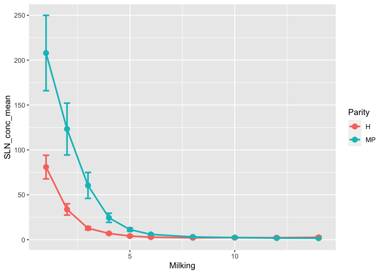
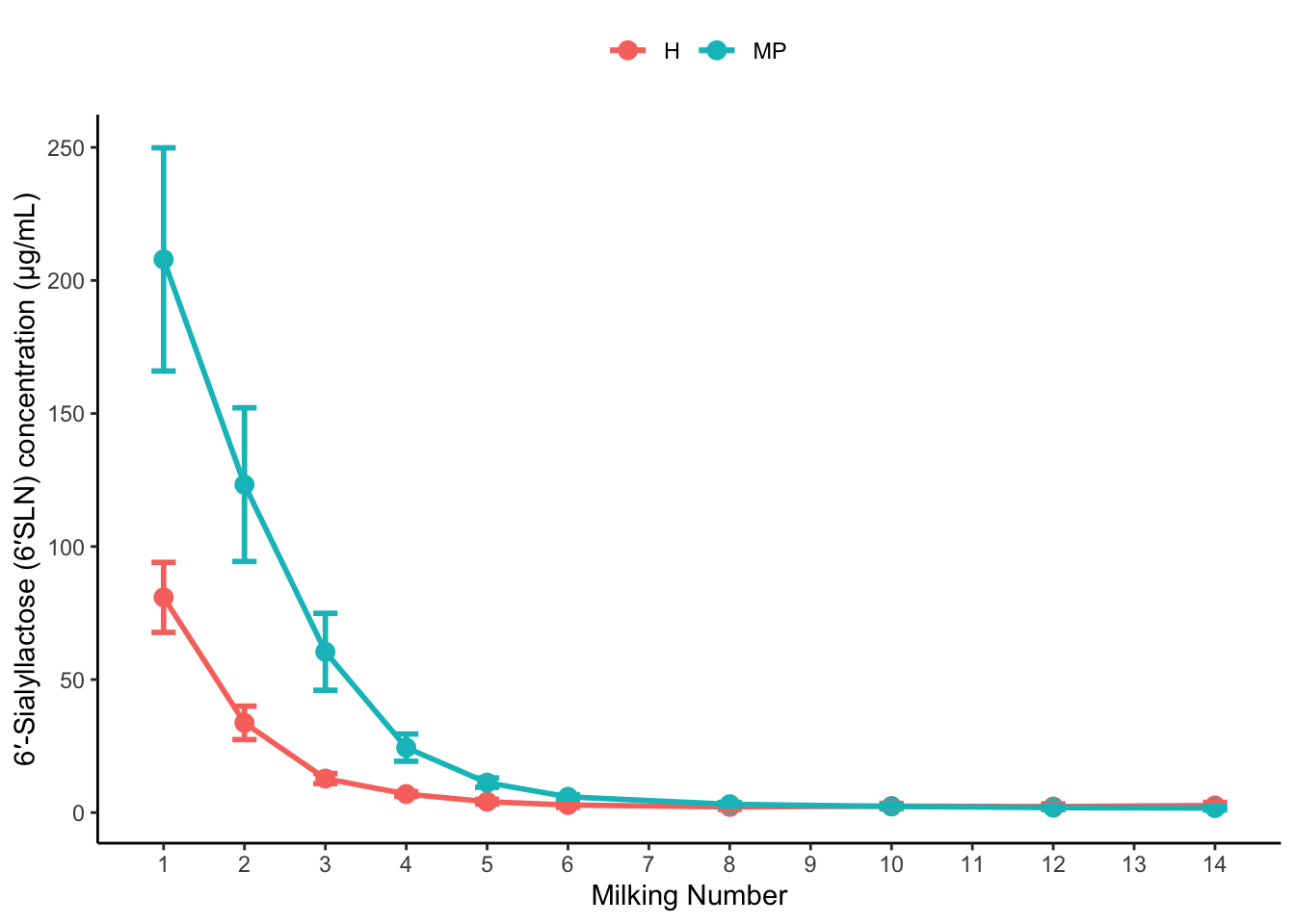
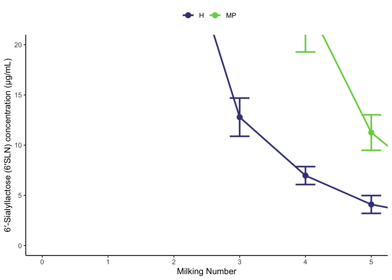
If we quickly wanted to increase the number of ‘breaks’ (the lines we see), then we could increase the n.breaks to a high number. Otherwise we can be more specific.

```{r}
(p_CONC_6_SLN <- 
   p_CONC_6_SLN+
   scale_x_continuous(breaks = seq(from = 0, 
                                   to = max(six_SLN_conc_to_plot$Milking), 
                                   by = 1)
                      ) # we used the seq function to make our numbers.
   )
```

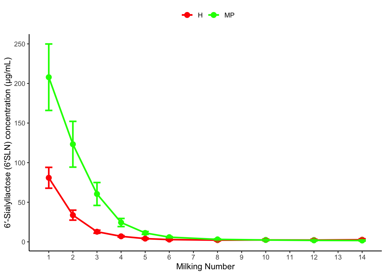
We can also edit the scales if we want to modify the colours used. Previously we were modifying a continuous scale because the x axis is numbers. This time, the colour scale is discrete, but if we want to control the colours manually we can use:

```{r}
p_CONC_6_SLN +
  scale_colour_manual( values = c("red", "green"))
```

This wouldn’t be too handy if someone who was colourblind saw this. There’s packages dedicated to colour blind friendly plots, such as viridis. Also check out the ColorBrewer: https://ggplot2.tidyverse.org/reference/scale_brewer.html

```{r}
(p_CONC_6_SLN <-
  p_CONC_6_SLN +
  scale_colour_viridis_d(begin = 0.2, end = 0.8) #_d = discrete
 )
```

6.4 Zooming

Let’s say we wanted to focus on one part of this plot. There are 2 ways we could attempt to do this.

If we modified our scales using ylim() or xlim(), the data is actually removed and this can influence other aspects of your plot.

Normally we just want to ‘zoom in’. To do this, we use coord_cartesian()

```{r}
p_CONC_6_SLN +
  coord_cartesian(xlim = c(0, 5), ylim = c(0, 20))
```

6.5 Extensions

There’s a lot of possible extensions to ggplot that are collated here: https://exts.ggplot2.tidyverse.org/gallery/

6.5.1 Patchwork - joining plots together

In our case, we would need to join 2 plots together. We can use the patchwork package for this: https://patchwork.data-imaginist.com/

Let’s call our plot p_left, and let’s return to our penguins to get our right hand side plot:

```{r}
p_left <- p_CONC_6_SLN 

p_right <- 
  penguins %>% 
  drop_na(bill_length_mm, bill_depth_mm, sex) %>% 
  ggplot(aes(x = flipper_length_mm  , y =  bill_length_mm, colour = sex))+
  geom_point()+
  scale_color_manual(values = c("darkorange","cyan4"), na.translate = FALSE)+
  theme_bw()+
  theme(panel.grid = element_blank())+
  xlab("Flipper Length (mm)")+
  ylab("Bill Length (mm)")
```

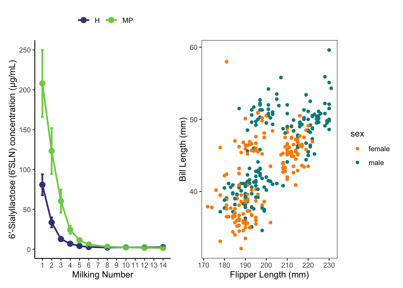
To use the patchwork we simply load the package, and ‘add’ them together:

```{r}
library(patchwork)
p_left + p_right
```

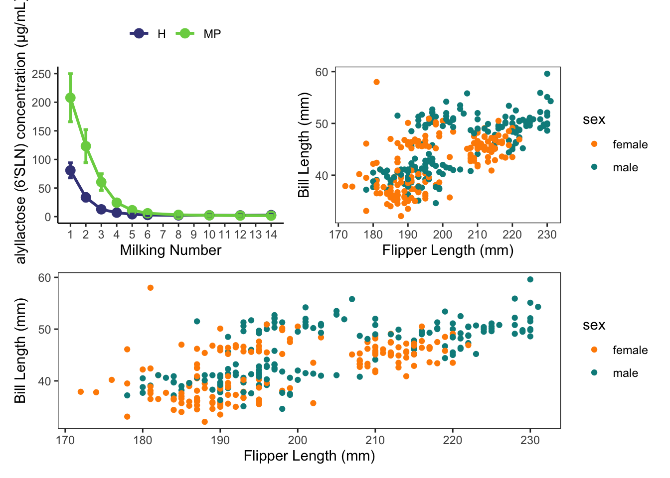
There’s more complex ways to join plots together too, so check out the help page for it.

```{r}
(p_left + p_right) / p_right
```

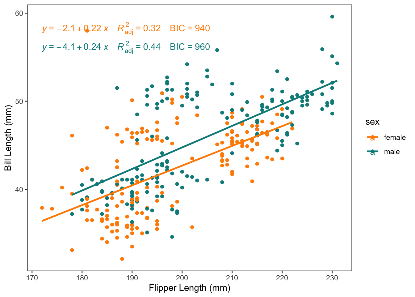
6.6 Adding regressions with labels

To revisit automatic regression lines, sometimes we want to display some summary stats as well. The ggpubr package has a bunch of useful additions to ggplot, including this one.

```{r}
p_right +
  geom_smooth(method = 'lm', se = FALSE)+
  ggpubr::stat_regline_equation(aes(label =  paste(after_stat(eq.label), 
                                                   after_stat(adj.rr.label), 
                                                   after_stat(BIC.label),
                                                   sep = "~~~~")))
```
`geom_smooth()` using formula = 'y ~ x'
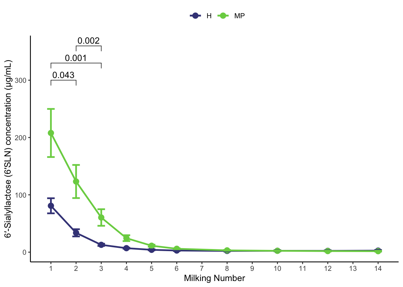
6.7 Adding p-values

The ggpubr package is also great for adding p-values to plots. It can get a little tricky when the p-values are calculated elsewhere (e.g. SAS), but the documentation explains everything.

Let’s pretend we have a couple of P values calculated from outside of R. We can recreate some dummy values here:

```{r}
# these column names are important. It needs to have group1 and group2, and the p.adj is the name of the label we tell it later.
stats <- tibble::tribble(
  ~group1, ~group2,   ~p.adj,
     1,       2,       0.043,
     1,       3,       0.001,
     2,       3,       0.002
  )
stats
```
# A tibble: 3 × 3
  group1 group2 p.adj
   <dbl>  <dbl> <dbl>
1      1      2 0.043
2      1      3 0.001
3      2      3 0.002

Then, we can add them manually to our plot:

```{r}
p_CONC_6_SLN+
  ggpubr::stat_pvalue_manual(
    stats, 
    y.position = 300, step.increase = 0.1,
    label = "p.adj"
    )
```

Of course, this doesn’t make a lot of sense for this graph. But you can see how it would be useful for pairwise comparisons.

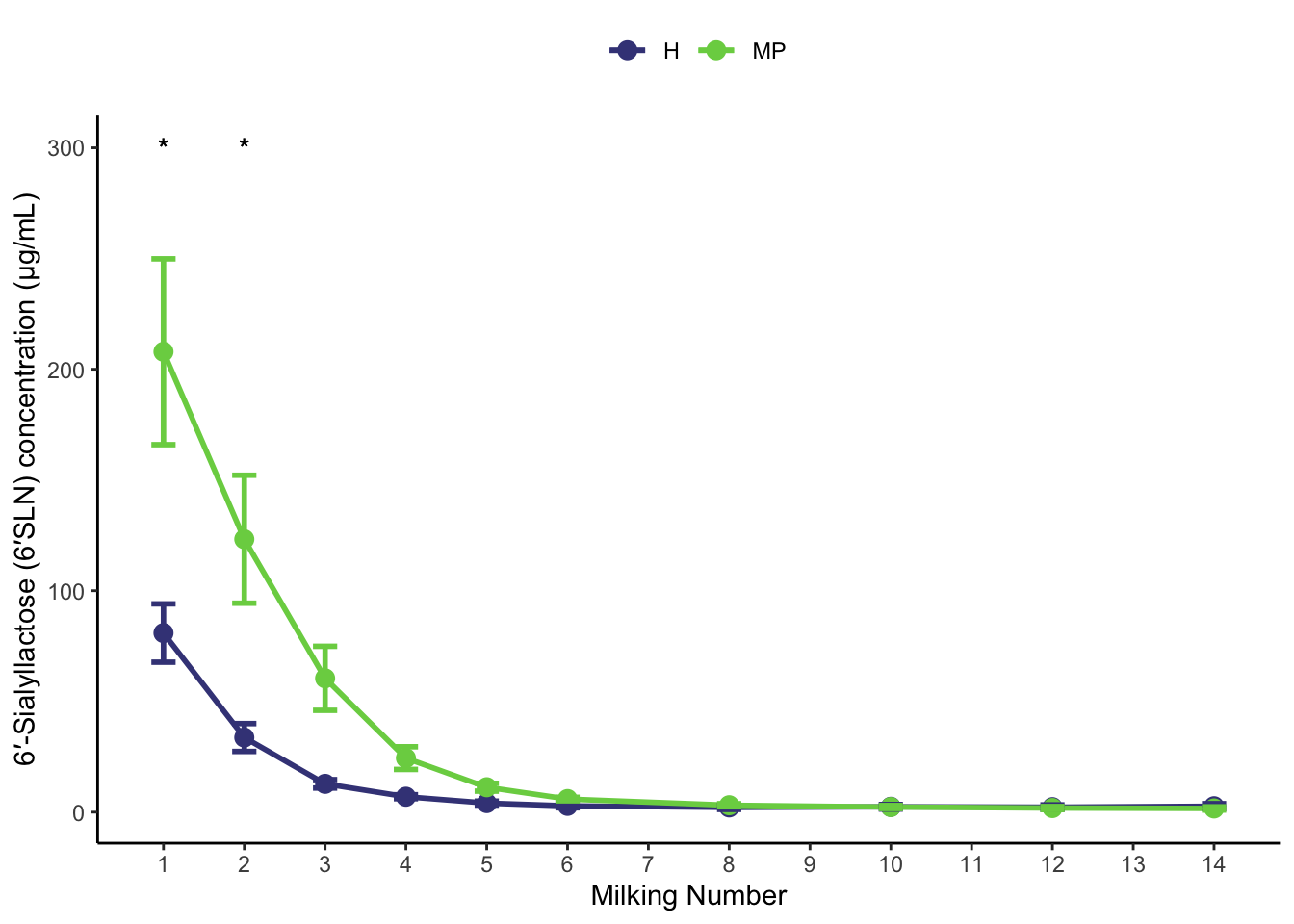
6.8 Manual annotations

If you just wanted to add some stars, like in the original Fig 3 of the paper, we could also annotate the graph manually.

```{r}
# add annotation column to original data and copy to use here

quick_annot_data <- 
six_SLN_conc_to_plot %>% 
  ungroup() %>% 
  select(Milking) %>% 
  mutate(annot = case_when(Milking %in% c(1,2) ~ "*", TRUE ~ ""))

p_CONC_6_SLN +
  geom_text(aes(x = Milking, 
                y = 300, 
                label = annot), 
            data = quick_annot_data, 
            inherit.aes = FALSE )
```

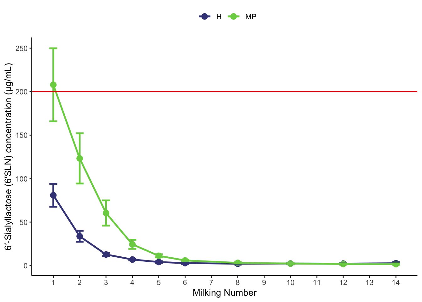
You could also add lines, or other text using a similar approach:

```{r}
## add horizontal line
p_CONC_6_SLN +
  geom_hline(aes(yintercept = 200), colour = 'red')
```

Or map some text:

```{r}
p_CONC_6_SLN +
  geom_text(aes(label = as.character(Milking), y = 200), colour = 'brown')
```