7  Intro to Advanced Plotting

7.1 Automation with functions

One of the most useful benefits of using R is that you start to write your own functions to automate tasks.

Let’s say I had a few hundred lactation curves I wanted to plot individually. I couldn’t facet them all, so I would need to plot them 1 at a time. But if I ever need to repeat something more than 3 times, it deserves to be in a function.

Let’s revisit the same data from Fischer-Tlustos (2020): https://doi.org/10.3168/jds.2019-17357

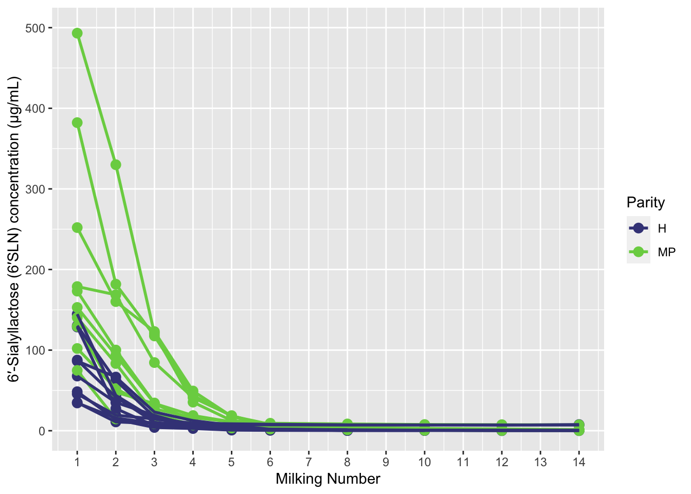
This time, we will plot each individual animal on own graph. First, let’s plot the raw data in a way that we might want to focus on some individual animals.

```{r}
p_raw <- 
  six_SLN %>% 
  ggplot(aes(x = Milking, y = six_SLN_conc, colour = Parity))+
  geom_point(size = 3)+
  geom_line(aes(group = Cow_ID),linewidth = 1)+
  scale_x_continuous(breaks = seq(from = 0, 
                                   to = 14, 
                                   by = 1))+
  scale_colour_viridis_d(begin = 0.2, end = 0.8)+
  coord_cartesian(ylim = c(NA, 500))+
  xlab("Milking Number")+ 
  ylab("6′-Sialyllactose (6′SLN) concentration (μg/mL)")
  
p_raw
```
Warning: Removed 18 rows containing missing values (`geom_point()`).
Warning: Removed 17 rows containing missing values (`geom_line()`).

It seems there’s a couple of individuals who are pretty high, and we might want to take a look. One option is to use interactive plots (see below), or we might want to plot one cow at a time.

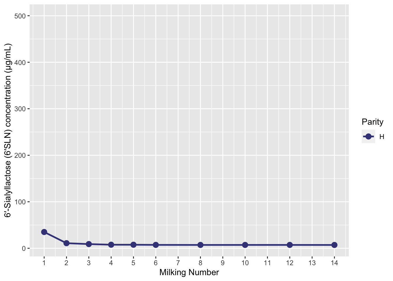
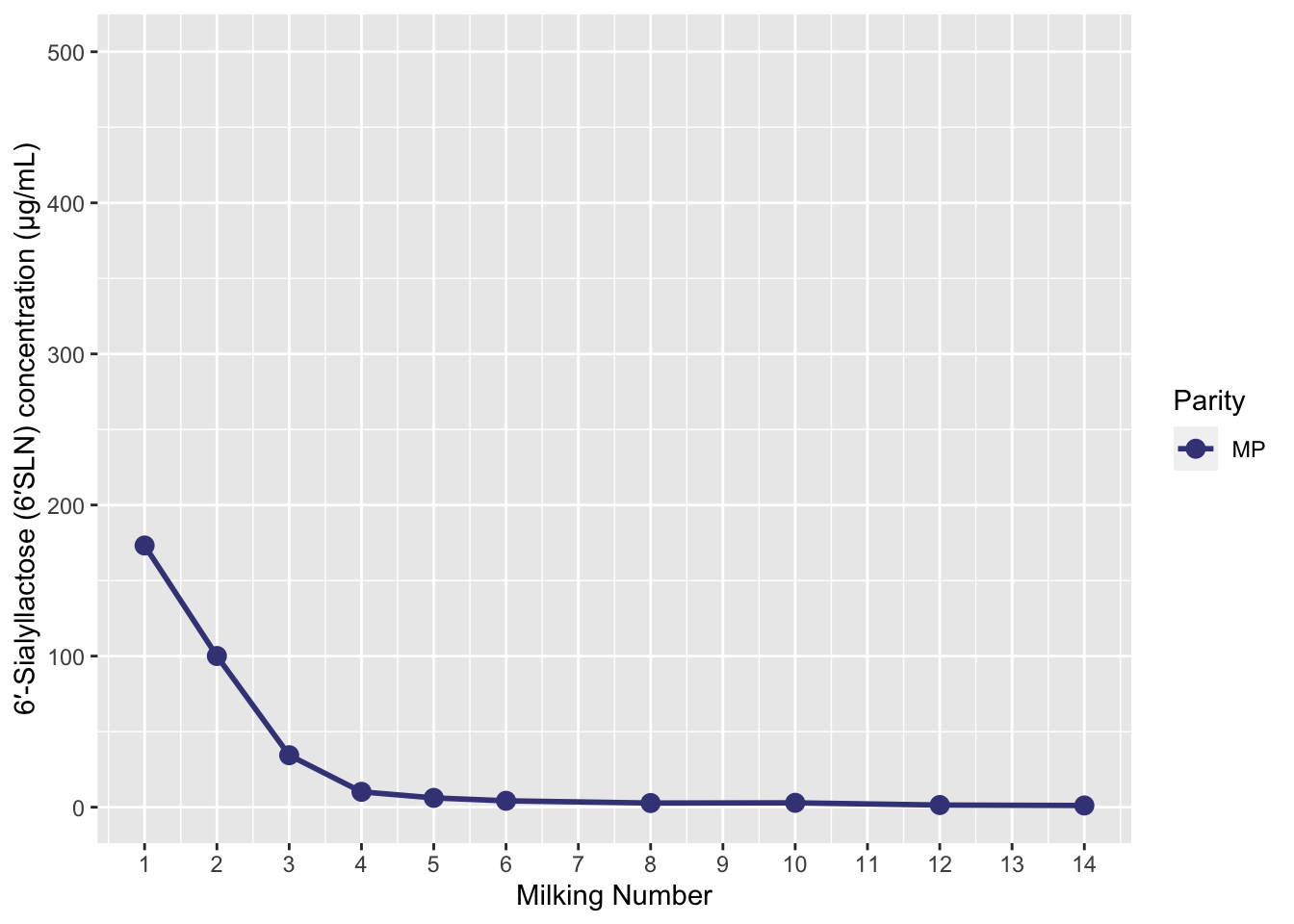
Let’s filter out 1 cow this time, and then re-plot. Notice that all of this code is identical to above, and we just added in a filter step.

```{r}
six_SLN %>% 
  filter(Cow_ID == 5716) %>% 
  ggplot(aes(x = Milking, y = six_SLN_conc, colour = Parity))+
  geom_point(size = 3)+
  geom_line(aes(group = Cow_ID),linewidth = 1)+
  scale_x_continuous(breaks = seq(from = 0, 
                                   to = 14, 
                                   by = 1))+
  scale_colour_viridis_d(begin = 0.2, end = 0.8)+
  coord_cartesian(ylim = c(NA, 500))+
  xlab("Milking Number")+ 
  ylab("6′-Sialyllactose (6′SLN) concentration (μg/mL)")
```

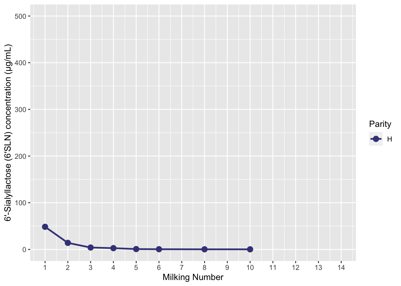
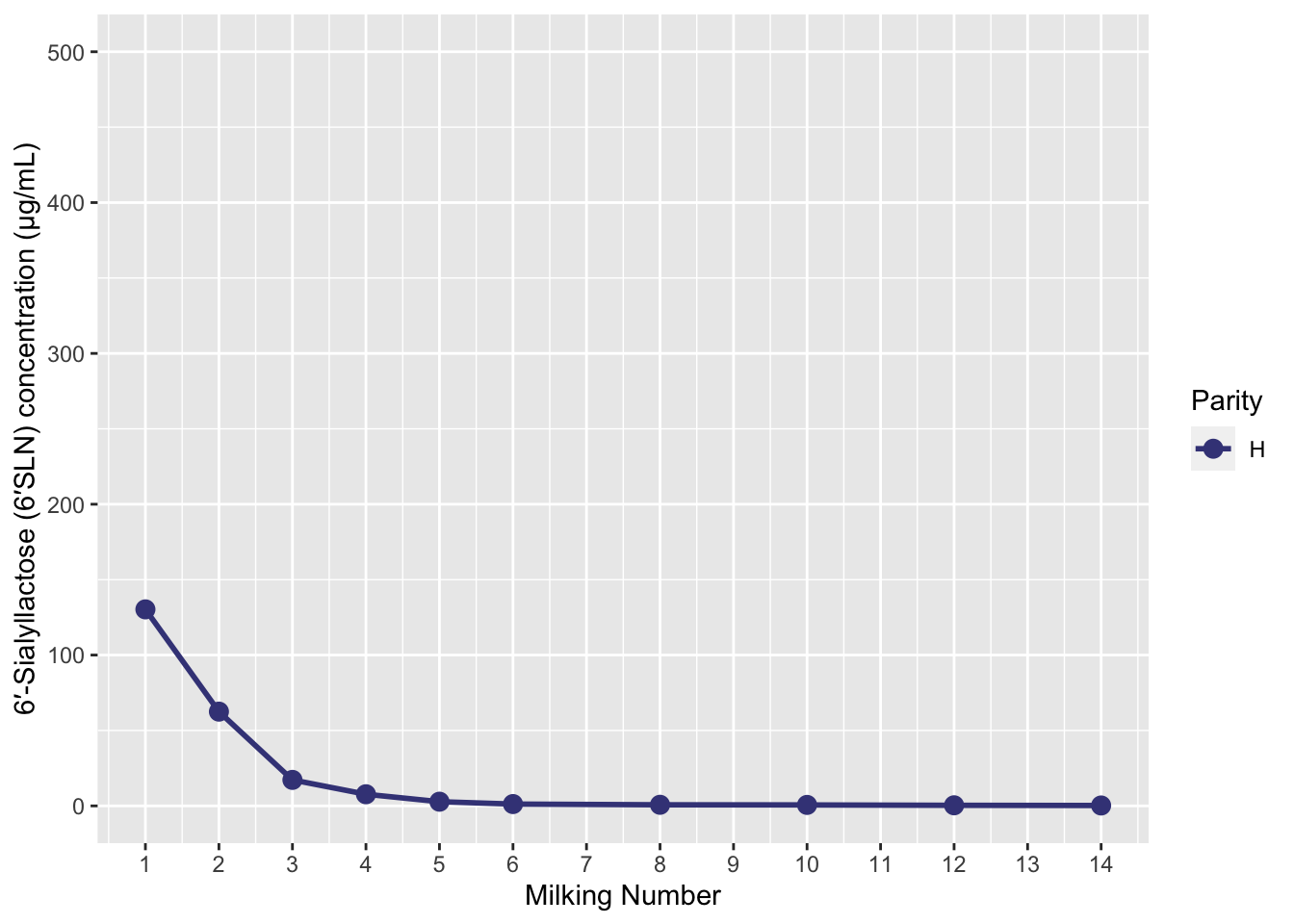
Let’s turn the ggplot part into a function to make it easier for us to re-use:

```{r}
# create the funciton, this takes a df as input and plots it
# The function is saved in the environment to re-use
# 
f_plot_individual <- 
  function(df_in){
    p <- 
      df_in %>% 
      ggplot(aes(x = Milking, y = six_SLN_conc, colour = Parity))+
      geom_point(size = 3)+
      geom_line(aes(group = Cow_ID),linewidth = 1)+
      scale_x_continuous(breaks = seq(from = 0, 
                                      to = 14, 
                                      by = 1))+
      scale_colour_viridis_d(begin = 0.2, end = 0.8)+
      coord_cartesian(ylim = c(NA, 500))+
      xlab("Milking Number")+ 
      ylab("6′-Sialyllactose (6′SLN) concentration (μg/mL)")
    
    return(p)
  }


#subset 1 cow of data to plotx
subset_data_test <- 
  six_SLN %>% 
  filter(Cow_ID == 5716)

# execute the function
f_plot_individual(df_in = subset_data_test)
```

Now we can give any dataframe to our function to plot, even the whole dataframe:

```{r}
f_plot_individual(six_SLN)
```
Warning: Removed 18 rows containing missing values (`geom_point()`).
Warning: Removed 17 rows containing missing values (`geom_line()`).

7.1.1 map

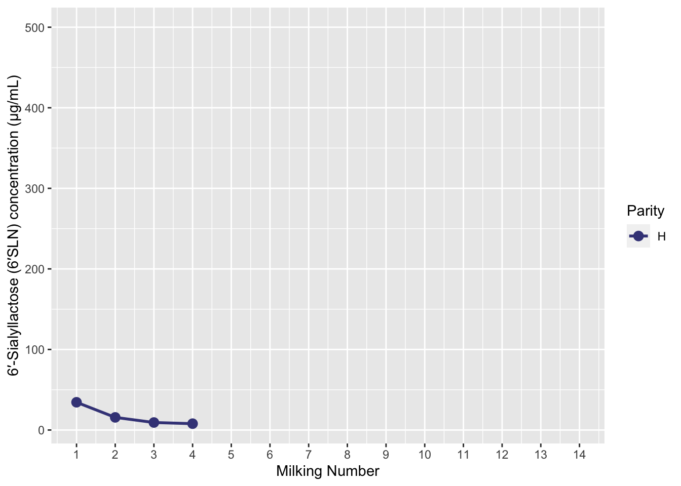
Now we are going to go back to a similar idea that we saw in split-apply-combine. This time we will be split our data frame into a list, and tell R to iterate through the list of small data frames and each time run our function.

```{r}
# split our dataframe into a list of small dataframes
list_of_dfs <- 
  six_SLN %>% 
  group_by(Cow_ID) %>% 
  group_split()
```

Let’s check the structure of our list. If we look at the first element in our list, it is a df with 1 cow_ID.

```{r}
list_of_dfs[1]
```
<list_of<
  tbl_df<
    Cow_ID       : integer
    Milking      : integer
    Parity       : character
    six_SLN_conc : double
    six_SLN_yield: double
  >
>[1]>
[[1]]
# A tibble: 10 × 5
   Cow_ID Milking Parity six_SLN_conc six_SLN_yield
    <int>   <int> <chr>         <dbl>         <dbl>
 1    154       1 MP            74.8          449. 
 2    154       2 MP            14.6           36.5
 3    154       3 MP             8.70          21.7
 4    154       4 MP             9.40          94.0
 5    154       5 MP             8.49         110. 
 6    154       6 MP             5.16          43.8
 7    154       8 MP             3.93          45.2
 8    154      10 MP             2.85          28.5
 9    154      12 MP             2.24          20.2
10    154      14 MP             1.36          15.0

Here we see the second element is the next cow:

```{r}
list_of_dfs[2]
```
<list_of<
  tbl_df<
    Cow_ID       : integer
    Milking      : integer
    Parity       : character
    six_SLN_conc : double
    six_SLN_yield: double
  >
>[1]>
[[1]]
# A tibble: 10 × 5
   Cow_ID Milking Parity six_SLN_conc six_SLN_yield
    <int>   <int> <chr>         <dbl>         <dbl>
 1   2449       1 MP          140.          1685.  
 2   2449       2 MP           83.4         1418.  
 3   2449       3 MP           21.2          339.  
 4   2449       4 MP            7.02         112.  
 5   2449       5 MP            3.40          71.3 
 6   2449       6 MP            2.09          35.5 
 7   2449       8 MP            1.12          21.2 
 8   2449      10 MP            0.702         13.7 
 9   2449      12 MP            0.274          4.92
10   2449      14 MP           NA             NA   

Now, let’s iterate through the first 3 and last 3 in the list and give it to our function

```{r}
#| warning: false
purrr::map(list_of_dfs[c(1:3,18:20)], ~ f_plot_individual(.x))
```
[[1]]

[[2]]

[[3]]

[[4]]

[[5]]

[[6]]

7.2 Interactive plots with plotly

Making interactive plots is easy now that you’re used to using RNotebooks (which are actually producing a .html file that can accommodate interactive plots in your output). This is made even easier because we only need 1 simple function: ggplotly()

See here for details on customising output: https://plotly.com/ggplot2/

Once we have a ggplot object, we can give it to ggplotly:

```{r}
plotly::ggplotly(p_raw)
```

7.3 Correlations

We saw this at the start, but this time it should look a bit easier to understand.

See: https://allisonhorst.github.io/palmerpenguins/articles/pca.html

```{r}
#| warning: false
penguins %>%
  select(species, body_mass_g, ends_with("_mm")) %>% 
  GGally::ggpairs(aes(color = species),
          columns = c("flipper_length_mm", "body_mass_g", 
                      "bill_length_mm", "bill_depth_mm")) 
```

7.4 PCA

This same link has a good resource for PCA analysis as well: https://allisonhorst.github.io/palmerpenguins/articles/pca.html

7.5 Heatmaps

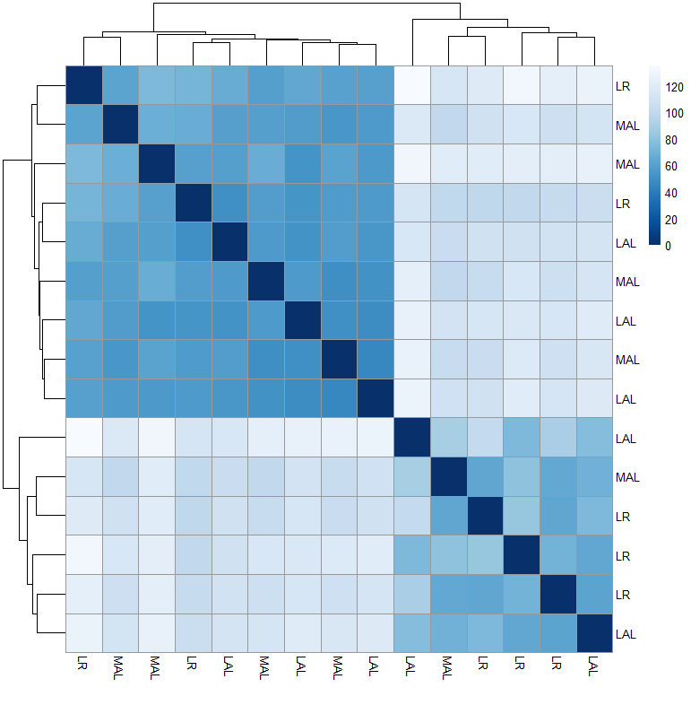
A great package for heatmaps is pheatmap. However it isn’t as well document. See: https://davetang.org/muse/2018/05/15/making-a-heatmap-in-r-with-the-pheatmap-package/

It’s particularly useful for larger datasets and exploratory work. This is one example from some gene expression work:

The End.